


April 21, 2016

The travails of selling real estate came home to us forcefully in the last few months.
We are rather happily engaged with designing and monitoring the construction of an office building in Baroda that we in the office called “ The Alchemists Abode” the name referring to the clients metallurgical business interests.
The building is now formally called “ Ark”, in reference to a space where ideas will be safe and nurtured, and the idea of life will live.
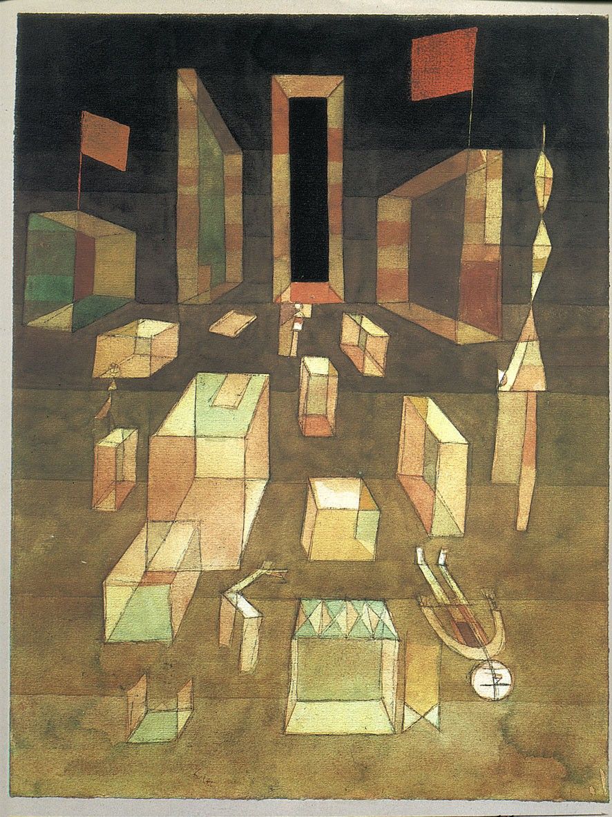
Parts of the project have been inspired by Paul Klees, 1929 painting “Uncomposed Objects in Space” ( above)
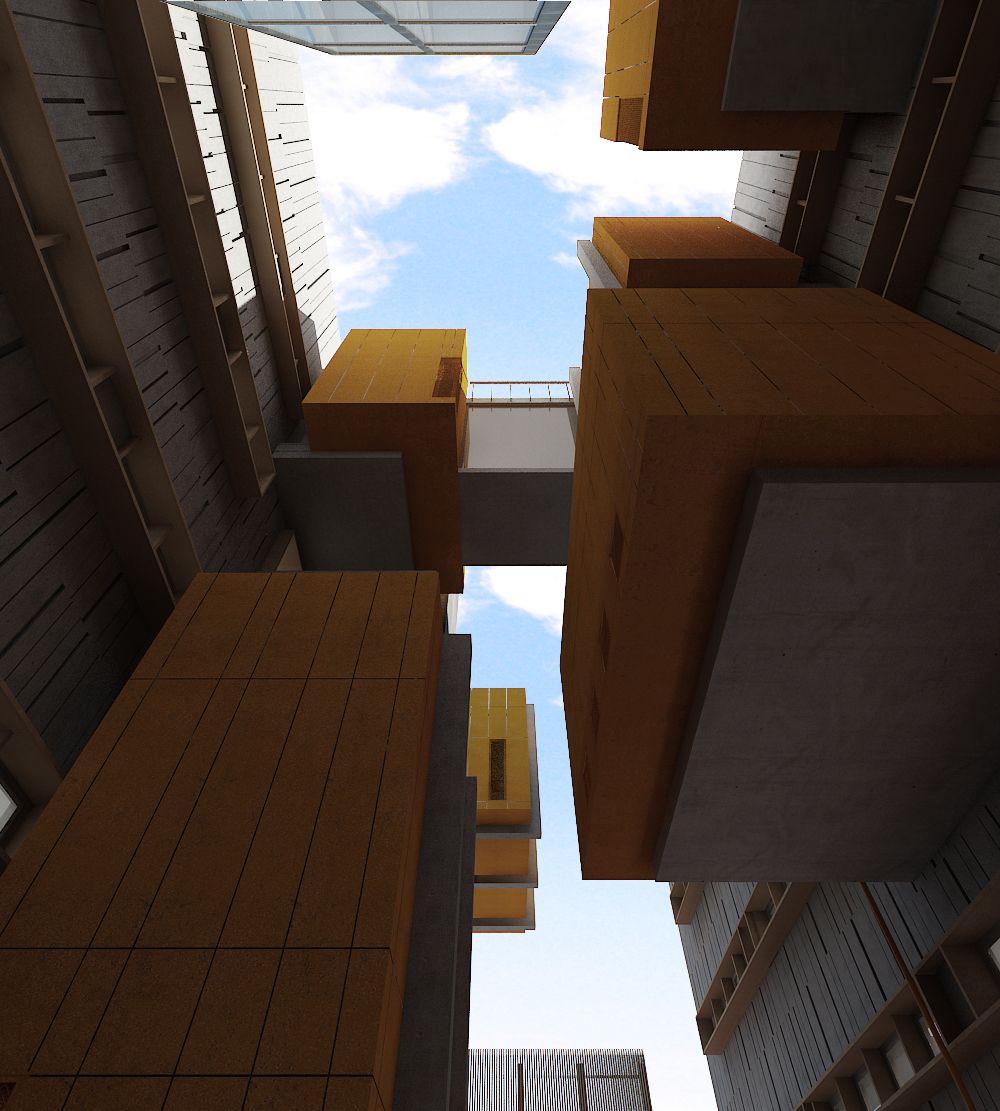 The atrium inspired by Klee.
The building uses the premise of using the idea of a tense chaos and suspended imbalance and yet denoting a stillness, as an allegorical reference to life today, and reflects it as an ode to Klee in the atrium.
The office spaces bathed in soft light are calmer.
Then one day of course Walter, the much loved artist from Ahmedabad, took over the building, and used it as his autobiographical sketchbook, with concrete, boulders, and wire mesh as his graphite. So suddenly the building became his canvas .
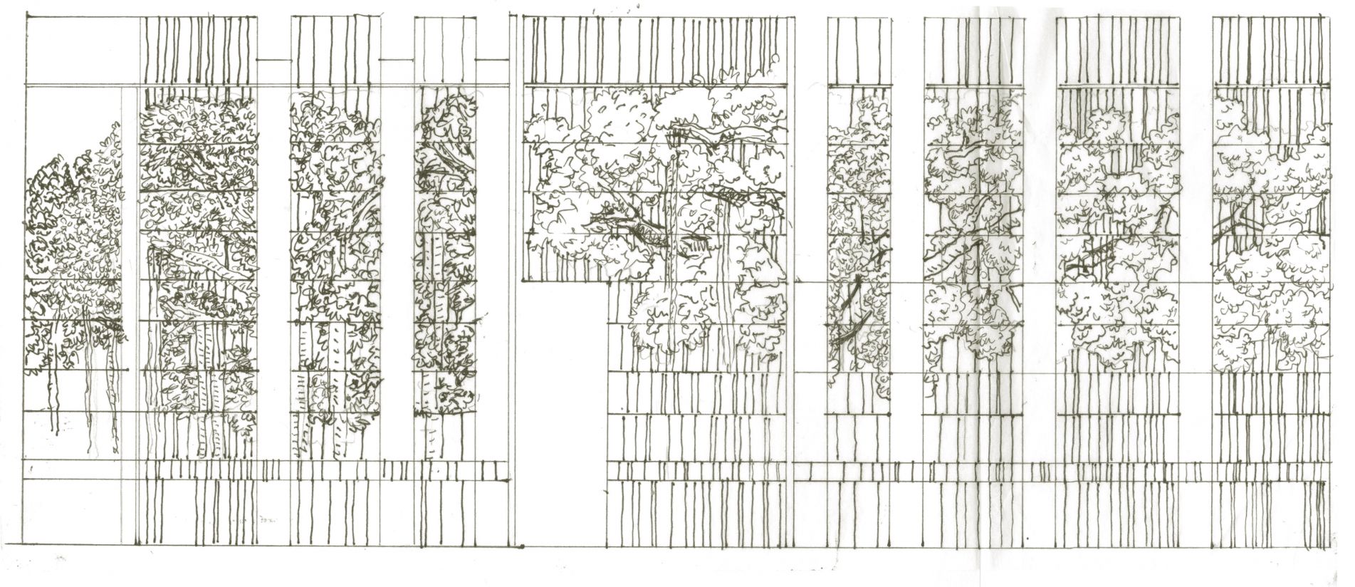
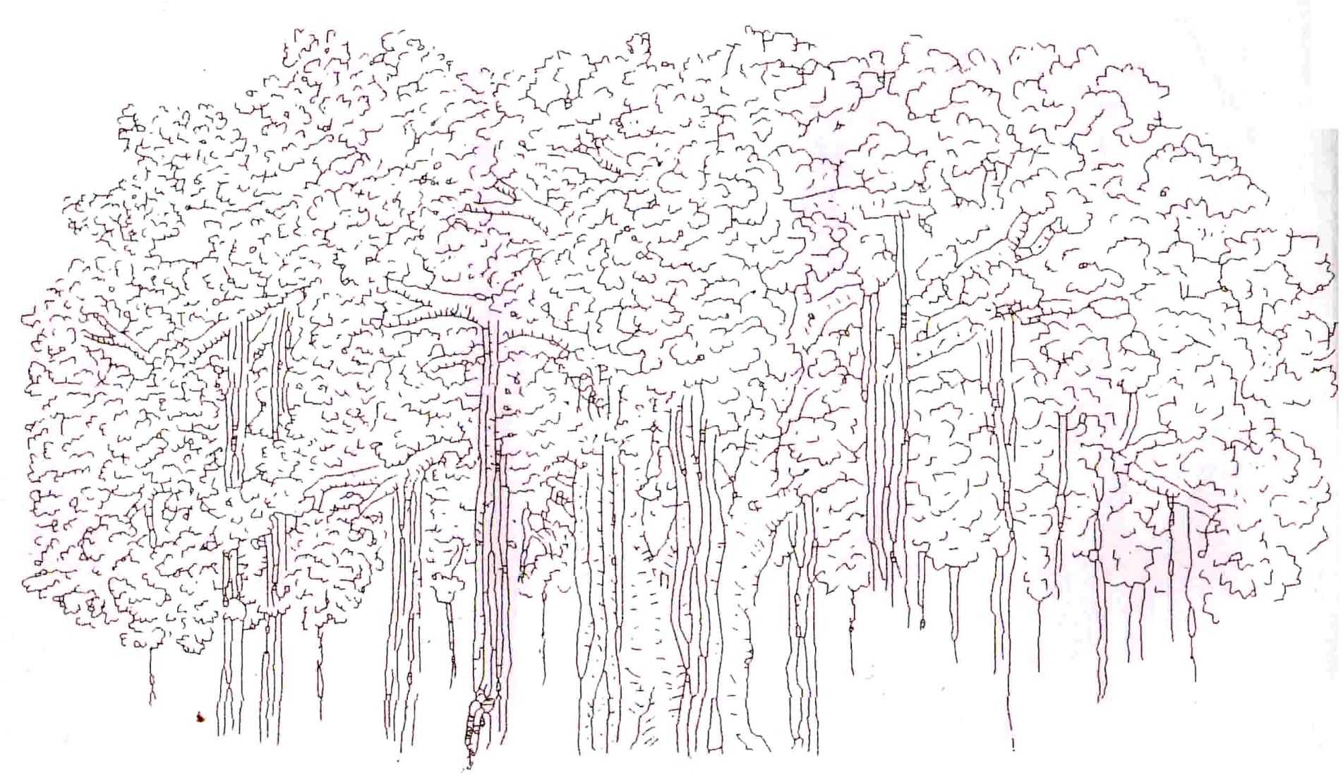
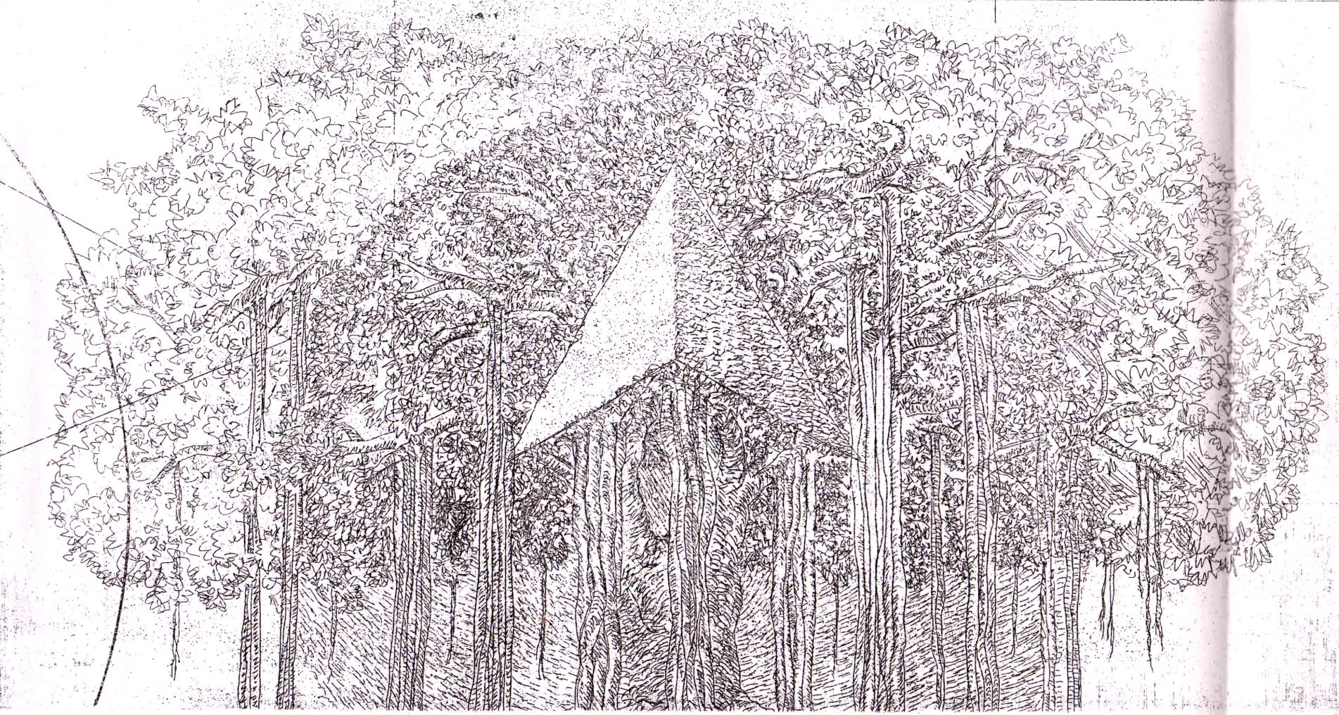
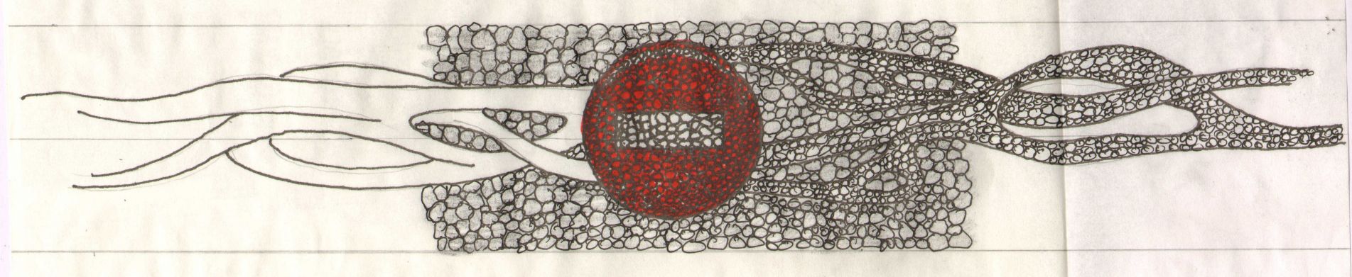
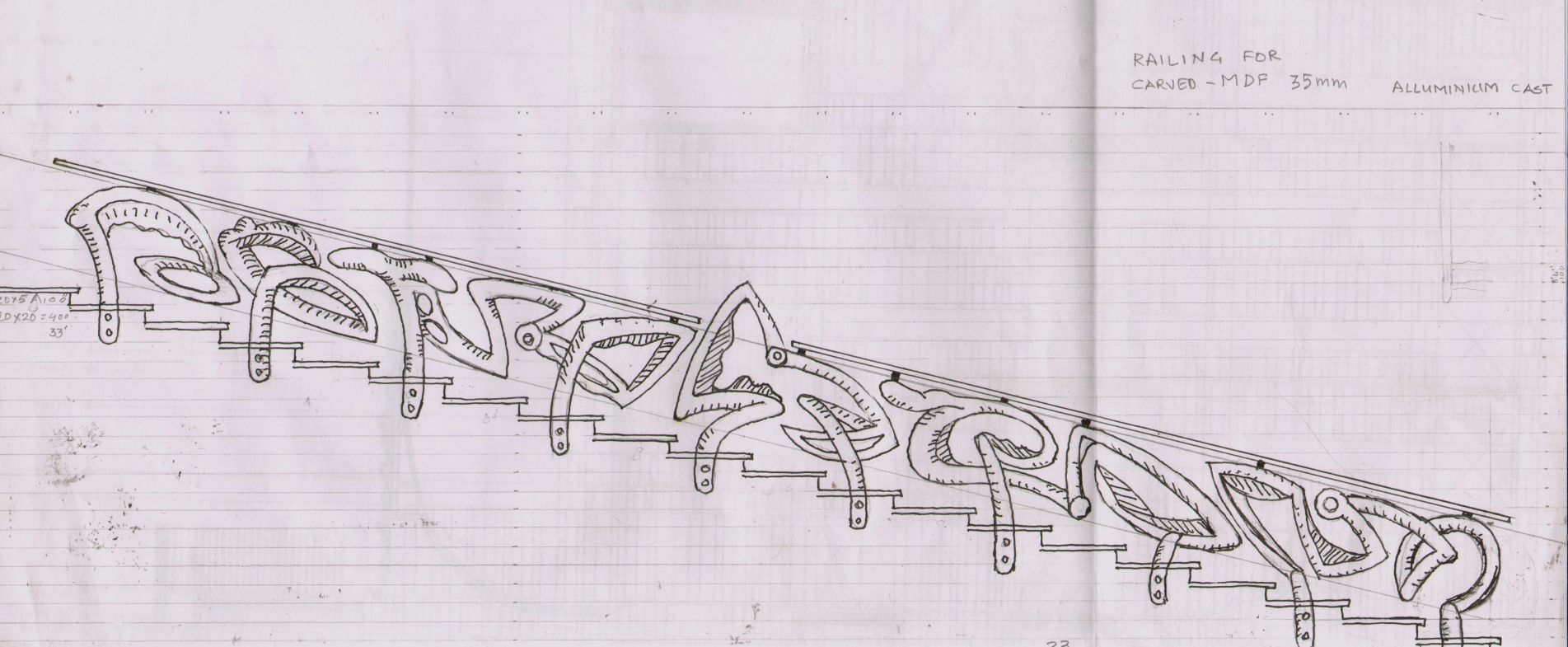
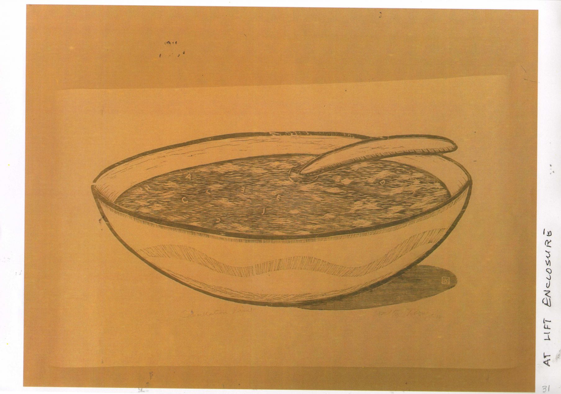
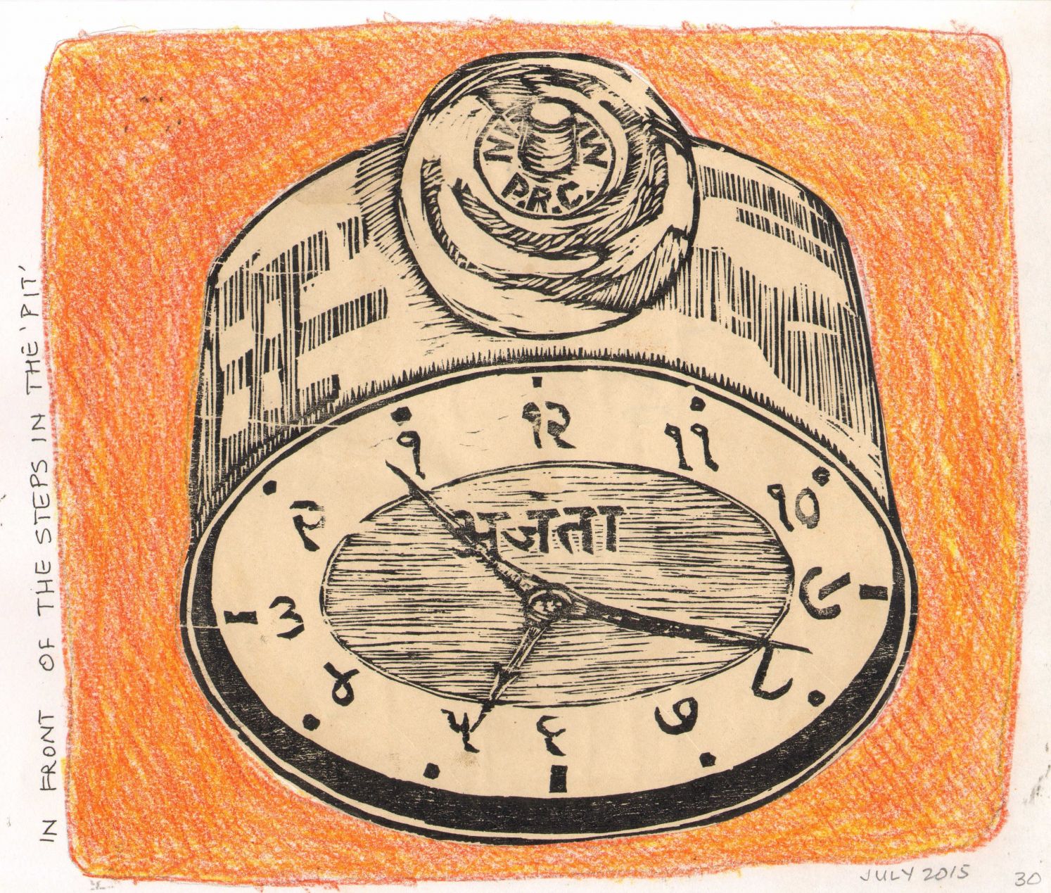
Series of sketches done by Walter; some as casting on the facade, some as stencils on the floor some as variations in the gabion walls and some as designs for stair railings.
This is and continues to be an exciting, enthralling and invigorating mental space.
And then came the call to do an e-brochure; so that the floors that the client would not occupy could be leased out.
We were stumped.
How could a building that claimed that is was part ode to Klee, part an example of fine craft and inventive thinking, a space of excellent construction, and finally literally Walter’s vellum, have a real estate brochure that was ordinary! (Delusional we are ofcourse!)
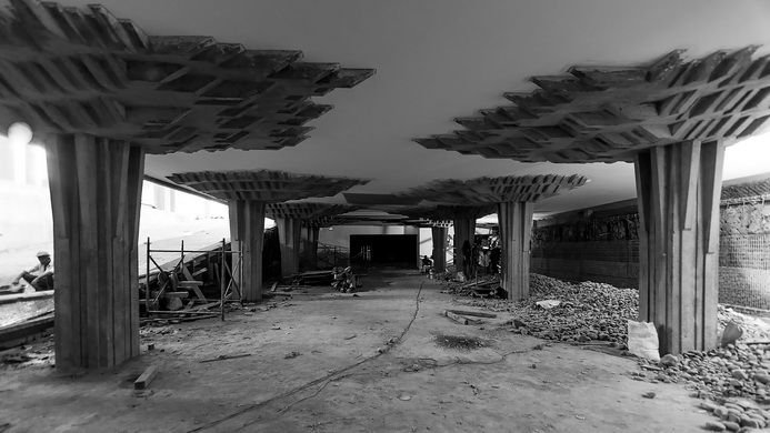
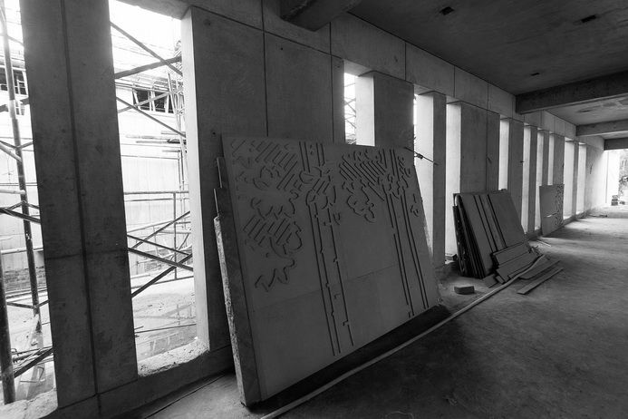
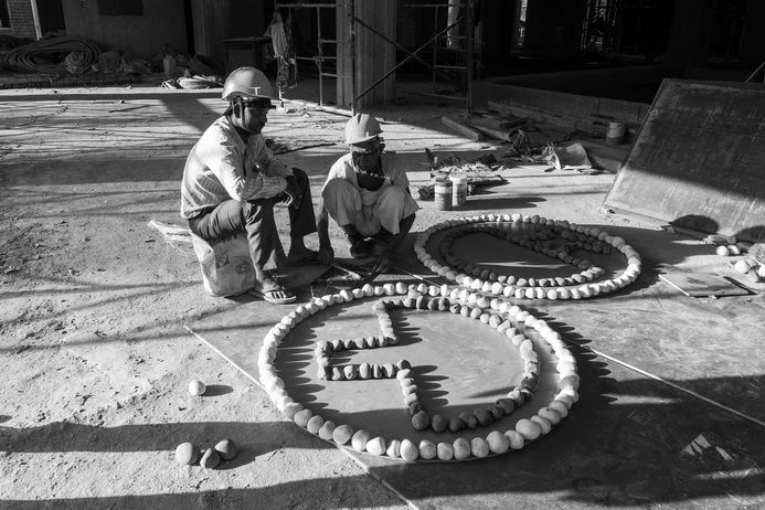
Construction pictures of the basement and others of Walters art being woven as part of the construction process. ( Pictures by ShilpaGavane; also see her pictures in the ARK website)
It seemed like blasphemy !
We turned to a young enthusiastic illustrator and designer; Sharvari Shah to see what she could come up with. ( You can reach her on www.behance.net/sharvarishah and see her presence in the website “Peoples ” page)
Even as we spelt out the brief we knew we were being unfair to the young illustrator. We said it had to be extremely artistic ( ofcourse!), invoking curiosity, signifying a certain sophistication of thought; and at the same time addressing and speaking to a possible buyer who should see this as a space that he would be drawn to inhabit.
And we also said that we would not succumb to using the imagery that real estate often is forced to use to denote sophistication, or an evolved space. This was our chance to say no to Trump; even if his country has to suffer him in the foreseeable future.
No stock images, no aspirational photos, no slick 3-ds , no Trump!
Original illustrations by Sharvari for the e.brochure- above images for the central stairs and the parking basement.
Sharvari slogged, panicked, complained, laughed, and slogged again; but the one thing she did not do, was to succumb to the kind of slick graphics that we see all around us; young professional , her first attempt at something like this, and this is what she came up with. www.theark.in
(And in all this she was supported by the ever calm Raj Shukla who we believe is a bit of an e.space maverick; raj@coronation.in)
Do see it. Do tell us what you think about it. We seem to be happy with it.
For website click on; www.theark.in